 CXLLUM
Track Everything
Welcome back, nobody!
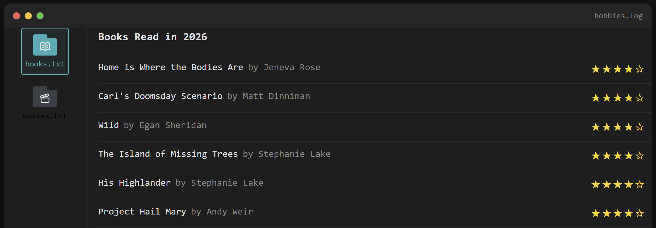
Big one this time. The About page has a new terminal window living underneath the "who the f*ck is Cxllum" text; a little file explorer with a sidebar of icons, currently holding books.txt and movies.txt, each one pulling live from "the database" and tracking what I've read or watched this year, complete with star ratings. More categories (Crafts is next, probably) can just get bolted on later without touching the JavaScript at all, which is the part I'm most pleased with.
Here's how it came together, mistakes included.
Books first, movies for free
I started by adding a rating column to my existing books_read table, bulk-set everything to 5 stars to get something on screen fast (sorry to every book that didn't actually deserve 5 stars), and wrote a PHP query to pull back whatever I'd finished reading this year. Nothing revolutionary — YEAR(finished_at) = ?, ordered by most recent.
The sidebar itself is built like a mini file system: a .file-sidebar with icon buttons, a .file-content area with one "pane" per category, and some JavaScript that swaps which pane is visible depending on which icon you click. Each icon carries a data-pane="books" attribute, each pane has a matching id="pane-books", and the JS just matches the two up.
The hard work paid off when I wanted to add Movies. New table (movies_watched), near-identical query, one new sidebar button, one new content pane — and it just worked first try, switching cleanly between Books and Movies with zero changes to the JavaScript. Genuinely satisfying when a bit of forward planning pays off like that.
The centring bug that wasn't where I thought it was
Spent a good while convinced my single sidebar icon wasn't centred. Turned out align-items: center was doing its job perfectly — the actual problem was padding-right: 16px on the sidebar, applied to only one side, which was quietly shrinking the space being centred within, not the icon itself. Swapped it for padding: 0 16px (both sides) and the icon snapped into place. Sometimes the bug isn't the rule you're staring at, it's the rule two lines above it.
The CSS ordering gotcha
Got the star ratings stacking left-aligned on mobile, tested it, and... nothing changed. Turned out I'd pasted my @media (max-width: 768px) override above the base .book-item rule in the stylesheet, rather than below it. CSS applies later rules over earlier ones when specificity ties, so my "fix" was quietly losing to a rule that came after it in the file. Moved the media query to the bottom, and mobile finally stacked title, author, and stars into one tidy left-aligned column instead of stars floating awkwardly off to the right.
Classic Callum: writing a fix, testing it, and only later realising the fix was in the wrong postcode.
Icons that actually render everywhere
Early attempts used emoji — 📚 for books — which looked fine on my desktop and then rendered as a sad little ?? the moment I checked it on my Android phone. Swapped both icons for proper SVGs from Lucide, an open-source icon set, dropped straight into the file-icon shape. Bonus: because they use stroke="currentColor", they automatically pick up the teal accent colour on hover, same as the rest of the site, no extra CSS required. Should have started here.
Key Features
- Terminal-styled file explorer widget on the About page, with a sidebar of category icons
- Books and Movies panes, both pulling live data from MySQL with star ratings (
★★★★☆style, not asterisks — much nicer)- Click-to-switch panes via vanilla JS, built to scale to more categories without any JS changes
- Lucide SVG icons for the sidebar, matching the existing folded-file look from the blog nav buttons
- Mobile-responsive layout, including a left-aligned stacked view for book/movie ratings on narrow screens